
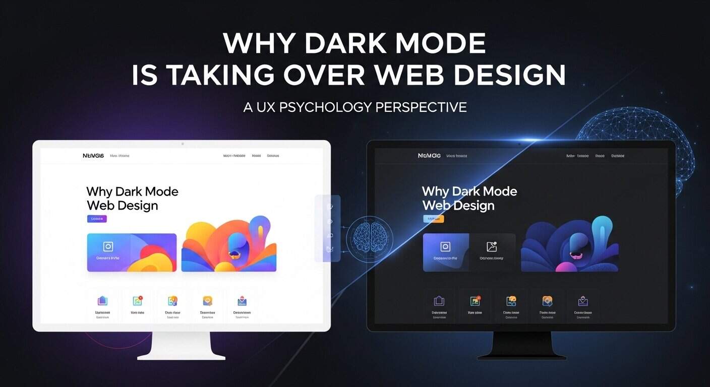
In the last few years, we’ve witnessed a massive shift in digital aesthetics. From macOS and Windows to apps like Instagram and WhatsApp, everyone has embraced Dark Mode. But why is this happening now? Is it just a trend, or is there a deeper scientific reason behind it?
As a web developer with a background in I/O Psychology, I’ve observed that the most successful design trends aren’t just “cool”—they solve a human problem. Dark Mode is the perfect example of UX Psychology meeting functional design.
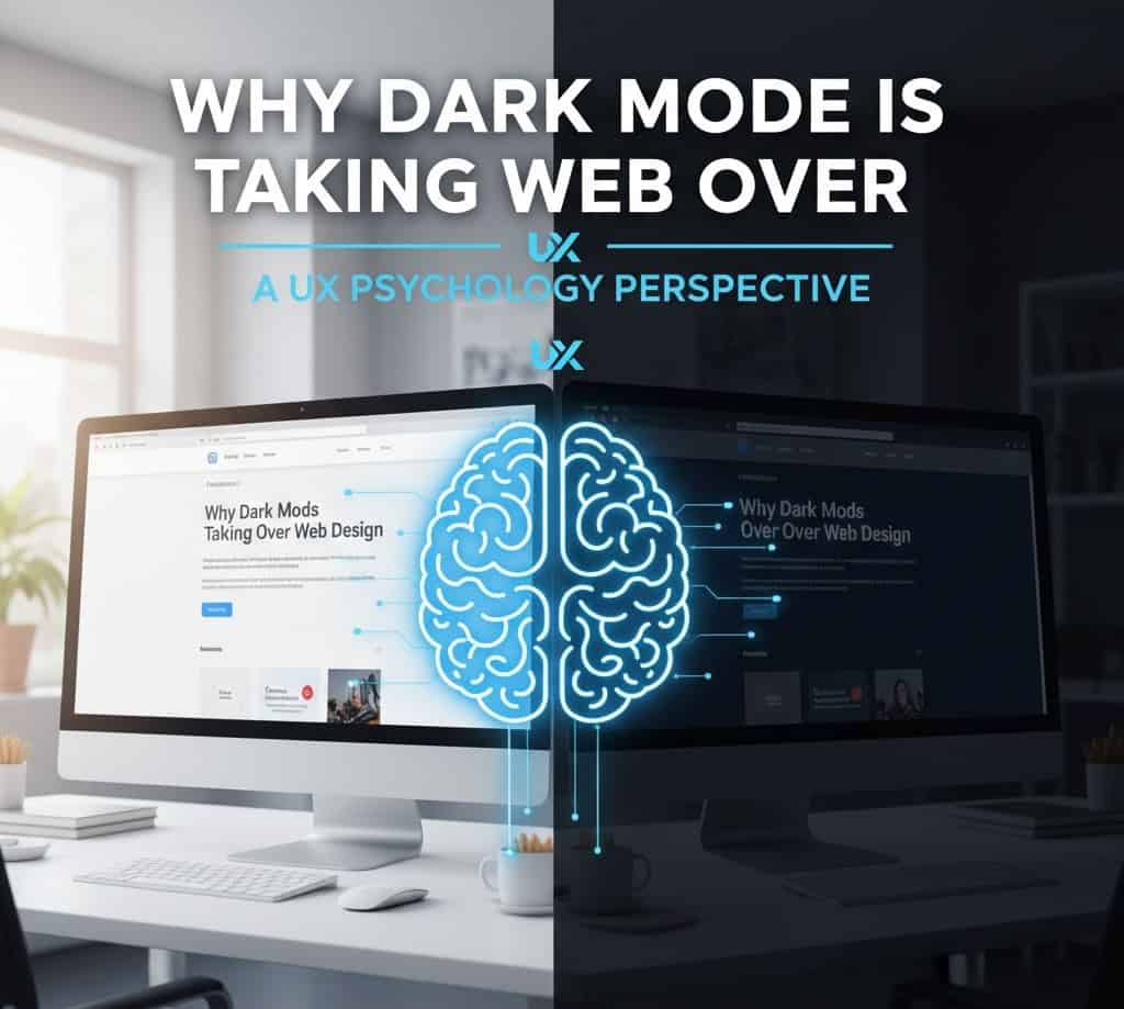
1. The Physiological Factor: Visual Ergonomics and Eye Health
The most obvious reason for Dark Mode’s rise is eye strain. In an era where the average person spends over 7 hours a day looking at screens, “white light” (which emits more blue light) is becoming a source of digital fatigue.
The Science of Pupillary Response
When you look at a bright white screen, your pupils constrict to limit the light entering the eye. Over time, the muscles controlling the pupil get tired. Dark Mode allows the pupil to remain more relaxed.
- Reduced Blue Light: Dark backgrounds emit significantly less blue light, which is known to disrupt sleep patterns by suppressing melatonin.
- Astigmatism Sensitivity: Interestingly, for some users with astigmatism, white text on black can cause a “halation” effect. This is why “Off-Black” (like
#121212) is psychologically more comfortable than pure#000000.
2. The Psychology of Perception: The “Luxury” Effect
In the world of branding and psychology, colors carry weight. White is often associated with cleanliness, clarity, and “utility” (think Google or Wikipedia).
However, Dark UI is psychologically linked to:
- Elegance and Luxury: High-end brands like Apple, Mercedes-Benz, and Netflix use dark themes to create a sense of exclusivity and premium quality.
- Focus and Immersion: When the background is dark, the “content” (colors, images, videos) pops more. This is why streaming platforms and gaming sites are almost always dark—they want to minimize environmental distractions.
3. The Power of Contrast and Accessibility
From a UX perspective, Dark Mode can actually improve readability—if done correctly.
Modern Contrast Ratios
Google’s Material Design guidelines suggest that the contrast ratio between text and the background should be at least 4.5:1. When you have a dark background, subtle glows and neon accents guide the user’s eye much faster than on a flat white page.
4. Battery Life: The Practical Psychological Win
Psychologically, users feel less “anxious” about their device status when they know they are saving power.
- OLED Technology: On modern OLED and AMOLED screens, black pixels are actually “off,” consuming zero power.
- The User Win: A user who feels their battery lasts longer on your site or app is subconsciously more likely to stay longer and return.
5. Better Information Hierarchy
In a light design, every element is competing for your attention. In a dark design, the designer has more control over the Visual Hierarchy. By using different shades of gray (surface colors), you can make certain cards or buttons feel “closer” to the user, mimicking real-world depth.
How to Implement Dark Mode the “Psychology” Way
If you are planning to add Dark Mode to your website, follow these rules to ensure it actually helps your UX:
- Don’t Use Pure Black: Pure black (
#000000) creates high contrast that is painful to read. Use dark grays. - Desaturate Your Colors: Bright, vibrant colors look much “louder” on dark backgrounds. Slightly desaturate them to avoid visual vibration.
- Allow User Control: Always give the user a toggle. Some people genuinely prefer “Light Mode” for reading long-form text in bright environments.
Conclusion: Is Dark Mode Here to Stay?
Dark Mode isn’t just a gimmick; it’s a response to how we live today. It respects the user’s health, enhances the premium feel of a brand, and optimizes technical performance.
At Shahzeb Speaks, we specialize in creating Ultra-Premium, Psychology-Driven Designs that don’t just look good but feel right to the human brain. Whether it’s a dark-themed portfolio or a high-converting Shopify store, we understand the science behind the scroll.
FAQ: Common Questions about Dark Mode
Is Dark Mode better for SEO?
Indirectly, yes. If Dark Mode improves your “Time on Page” and reduces “Bounce Rate” because users find it comfortable, Google will see your site as more valuable and rank it higher.
Does Dark Mode save battery on all phones?
No, it primarily saves battery on OLED or AMOLED screens. On standard LCD screens, the backlight is still on behind the black pixels.
Why does my eyes hurt after reading white text on black?
This is often due to high contrast or a condition called astigmatism. Ensure you use a soft gray background and a slightly off-white text color to reduce this.
Ready to upgrade your website to a premium dark-themed experience? Contact me today for a UX Psychology audit.