
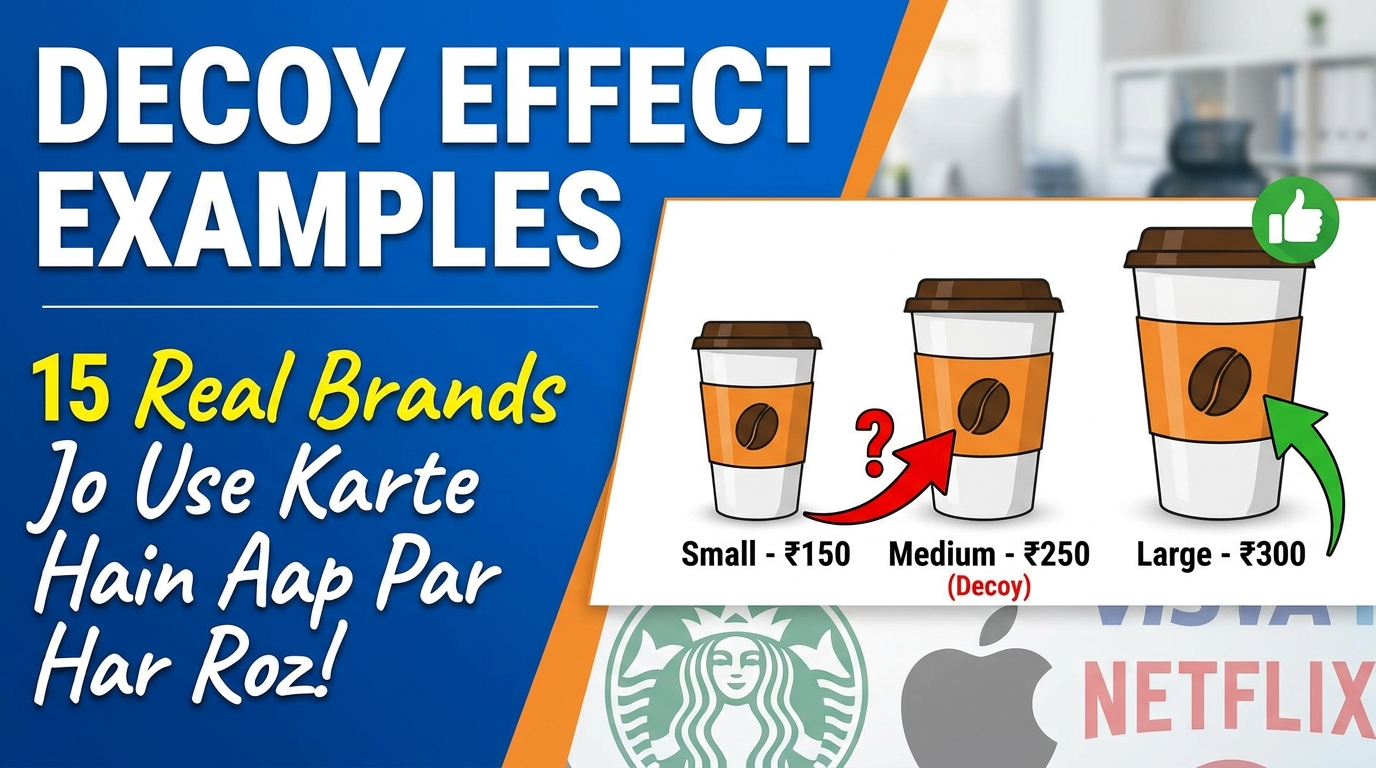
There is an item on almost every menu, pricing page, and product lineup that was never designed to be bought. It exists for one reason: to make the option next to it look like a bargain. Economists call it the decoy effect. I call it the most profitable item that nobody purchases, and once you learn to spot it, you will find it everywhere: at McDonald’s, on Apple’s website, inside your Netflix plan, and probably in the last thing you bought.
I am an Industrial and Organizational Psychologist, and pricing psychology is one of those areas where the research is old, solid, and still somehow invisible to most consumers. The decoy effect was documented academically in 1982. Forty-plus years later, companies still use it daily and most buyers still have no idea. This article fixes that. First the mechanism, then 15 real brands using it, then how to defend yourself, and a short honest section on where the “decoy” label gets overused.
“Humans rarely choose things in absolute terms. We don’t have an internal value meter that tells us how much things are worth. Rather, we focus on the relative advantage of one thing over another, and estimate value accordingly.”
— Dan Ariely, Predictably Irrational
🧠 What the decoy effect actually is
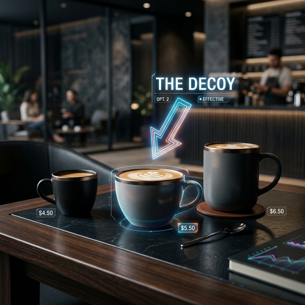
The decoy effect, known in research as asymmetric dominance, works like this: when people struggle to choose between two options, adding a third option that is clearly worse than one of them (but not the other) pushes people toward the option it resembles.
The decoy is not there to be chosen. It is there to make one specific choice feel obviously smart.
The original research came from Joel Huber, John Payne, and Christopher Puto in 1982. They showed that adding an inferior third option could increase preference for a “target” option, which broke a rule economists had assumed was untouchable: that adding an irrelevant alternative should never change your preference between two existing ones. It does. Reliably. In study after study since.
Why does it work? Because human brains are comparison machines, not calculators. We cannot easily judge whether a $7 popcorn is “worth it” in the abstract. But we can instantly judge that a $7 large is better than a $6.50 medium. The decoy hands our lazy brain an easy comparison, and we mistake winning that tiny comparison for making a good decision.
📰 The famous experiment: The Economist’s three subscriptions
If you have read anything about decoy pricing before, you have probably met this example. It is still the cleanest demonstration ever run, so it earns the first spot.
Dan Ariely noticed The Economist offering three subscription options: web-only for $59, print-only for $125, and print-plus-web for the same $125. The print-only option looks like a mistake. Who would pay $125 for print alone when print plus web costs exactly the same?
Nobody. And that was the point. Ariely tested it on 100 MIT students. With all three options, 84 chose print-plus-web and 16 chose web-only. Zero picked print-only. Then he removed the useless middle option and ran it again. The result flipped: 68 chose the cheap web-only option and only 32 chose print-plus-web.
One option that nobody wanted nearly tripled sales of the expensive package. That is the decoy effect in a single table:
| Option | With decoy | Without decoy |
| Web only ($59) | 16% | 68% |
| Print only ($125) — the decoy | 0% | removed |
| Print + web ($125) — the target | 84% | 32% |

🍟 15 real brands using the decoy effect
1. The Economist
Covered above, and included in the fifteen because it was a real, live pricing page, not a lab construction. The magazine ran it for years. Whether the pricing team designed it deliberately or stumbled into it, the structure was textbook: a dead option priced identically to the target.
2. McDonald’s
Look at drink and fries pricing next time you order. The medium is usually priced within a small step of the large, while the small sits far below both. The medium’s job is to make the large feel like the only rational upgrade: “just 50 more for a large?” The gap between small and medium is where the profit psychology lives, because it makes the medium look bad and the large look brilliant. Combo meals run the same play at a bigger scale: pricing the combo barely above the burger alone turns the standalone burger into a decoy against its own combo.
3. Apple
Apple’s storage tiers are the most polished decoy architecture in consumer tech. The base iPhone’s storage is deliberately modest, and the first storage upgrade is priced to feel small relative to the phone’s total cost. On the Mac lineup, configurations often stack so that the mid-tier model, once you add the upgrades most buyers want, lands within touching distance of the next model up. The mid configuration exists mostly to walk you upstairs. Apple has run versions of this ladder since the iPod era, and it is one reason average selling prices keep climbing without customers feeling pushed.

4. Movie theater popcorn
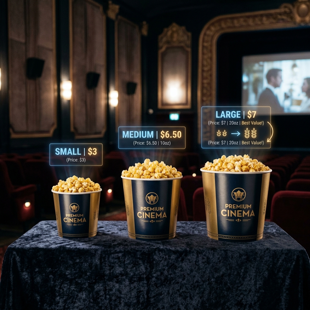
The classic field demonstration, popularized by a National Geographic experiment: a small popcorn at $3 and a large at $7 makes people buy small. Add a medium at $6.50 and suddenly the large at $7 sells, because paying 50 cents more for far more popcorn feels like winning. Nobody buys the medium. The medium is not merchandise, it is a signpost pointing at the large.
5. Starbucks
Tall, Grande, Venti. The middle size is consistently priced close enough to the largest that the upgrade feels trivial per ounce. Starbucks also benefits from a related quirk: hiding the smaller “Short” size off the printed menu shifts the whole reference frame upward, so the Tall reads as the small option and the ladder starts one rung higher.
6. Netflix
Streaming tiers are decoy playgrounds. Netflix’s plan structure has repeatedly featured a middle tier that is uncomfortably close in price to Premium while offering visibly less (lower resolution, fewer screens). The middle plan’s role is to make Premium look like the sensible spend. When Netflix shuffles its tiers, watch which plan gets the awkward price. That one is doing decoy duty.
7. Spotify
Individual, Duo, Family. Once two people share an account, Duo sits close enough to Family that a household starts asking why they would not just take the Family plan. The per-person math is the bait: the plans are arranged so the bigger bundle always wins the per-user comparison.
8. Adobe
Adobe’s Creative Cloud pricing has long featured single-app subscriptions priced so close to the full All Apps bundle that anyone needing two programs is effectively pushed to the whole suite. Photoshop alone at a substantial monthly fee makes the everything bundle look generous. The single-app plan is real, people do buy it, but its second job is making the bundle feel inevitable.
9. Amazon
Two layers here. Kindle book pricing sometimes places the hardcover close to an inflated ebook price, framing whichever format Amazon wants to move. And Prime’s monthly-versus-annual pricing makes the monthly option so poor on a per-year basis that it functions as a decoy for the annual commitment. The monthly plan exists, technically. Its main achievement is making annual Prime look like the obvious adult decision.
10. Williams-Sonoma’s bread machine
A retail legend documented by Ariely and by consultant Itamar Simonson’s research circle. Williams-Sonoma launched a home bread maker at $275 and it flopped. Then they added a bigger, fancier model at roughly $429. The expensive one barely sold, but sales of the original nearly doubled. The $429 machine gave shoppers a comparison that made $275 feel reasonable. Strictly speaking this leans toward anchoring and the compromise effect rather than a pure decoy, and I flag that because this example gets mislabeled constantly. More on that distinction below.
11. Domino’s and pizza sizing
Pizza chains price the medium close to the large almost everywhere in the world. In Pakistan, check any major chain’s deal menu: the regular-size deal is routinely a small step away from the large-size deal, and the large per-slice math embarrasses the medium. The medium exists so that groups ordering together talk each other into the large.
12. SaaS pricing pages (HubSpot and half the software industry)
Open any B2B software pricing page. Three columns. The middle one has a colored border and a “Most Popular” badge. The enterprise column on the right is often priced dramatically higher partly to make the middle tier feel moderate, and the starter tier is stripped down to just below usefulness so growing customers bounce off it quickly. This three-column theater is so standard that designers copy it without knowing the research it came from. Huber and his colleagues published the mechanism in 1982; the SaaS industry turned it into a template.
13. Restaurant wine lists
The second-cheapest bottle is one of the most studied items in menu engineering. Diners avoid the cheapest wine to avoid looking cheap, so the second-cheapest sells heavily, and restaurants know it, which is why that slot often carries the highest markup on the list. The cheapest bottle plays the decoy role: nobody wants it, everybody prices against it. Some menu consultants also add one absurdly expensive bottle at the top purely to reframe everything below it.
14. Car trims (Toyota and everyone else)
Base, mid, and full-option variants of the same car are a slow-motion decoy structure. In Pakistan the Corolla and Civic lineups demonstrate it well: the base variant is equipped just poorly enough that buyers who came in for it leave with the mid trim, and the mid trim’s price sits close enough to the top trim that the showroom conversation drifts upward again. Dealerships do not need to push. The ladder pushes.
15. Telecom bundles (Jazz, Ufone, and mobile operators worldwide)
Prepaid bundle menus are decoy mazes. A weekly package priced at, say, 250 rupees for a modest data allowance sitting next to a 300-rupee package with double the data is not two honest options. The smaller bundle exists to make the bigger one feel like free money. Operators run dozens of overlapping bundles at once, and the overlap is the strategy: with enough comparisons available, one of them will always make the target package shine. I covered the broader psychology of Pakistani telecom brands in my brand psychology audits if you want the deeper version.
⚖️ An honest caveat: decoy, compromise, and anchoring are cousins, not twins
Most listicles on this topic lump three different effects under “decoy,” and I would rather you leave this page knowing the difference, because it changes what you look for.
A true decoy (asymmetric dominance) is an option clearly worse than one alternative but not the other, like The Economist’s print-only tier. The compromise effect is our tendency to pick the middle of three options because extremes feel risky, which is what most three-tier pricing actually exploits. And anchoring is when an extreme price resets your sense of what is normal, like the $429 bread machine or the showpiece wine.
In the wild, brands blend all three, and the blend is the point. A SaaS pricing page might use the enterprise tier as an anchor, the starter tier as a near-decoy, and the middle badge to harvest the compromise effect, all in one screen. If a marketer tells you their pricing page uses “the decoy effect,” they are usually describing this whole cocktail. Fine by me. Just know which ingredient is doing what.
🛡️ How to spot the decoy (and stop paying the psychology tax)
One question defuses almost every decoy: “Which option would I choose if the others didn’t exist?”
Take the target off its pedestal. Cover the other prices with your hand if you have to, and ask whether the large popcorn is worth $7 to you in absolute terms, not whether it beats the medium. The decoy only works through comparison, so refusing the comparison switches it off.
Three more habits that help. Ignore any option nobody sane would pick, because its presence is information: someone put it there to steer you, and knowing the direction of the steer tells you where the margin is. Calculate per-unit prices when quantity is involved, since decoys hide in per-ounce and per-GB math. And on subscription pages, price the tier you actually need for a full year before looking at what the next tier “adds,” because the add-ons are framed to look small monthly and are rarely small annually.
💼 Using it ethically (for the business owners reading)
I consult on pricing psychology, so I will not pretend this knowledge is only for defense. If you sell things, decoy structures are legal, effective, and everywhere. My rule for clients is simple: the decoy is ethical when the target option is genuinely your best value, and manipulative when the whole ladder is engineered to push people past what they need.
A bakery pricing a 6-piece box at 500, a 9-piece at 850, and a 12-piece at 900 is nudging people toward more dessert. Nobody is harmed. A software company designing its starter tier to break at exactly the moment a customer is locked in is playing a different game, and customers eventually notice and write about it. The decoy effect moves a decision at the margin. It cannot fix a bad product, and used cynically, it converts one purchase into one grudge.
❓ Frequently asked questions
What is the decoy effect in simple terms?
Adding a deliberately unattractive third option to make one of the original two options look like a great deal. The unattractive option (the decoy) is not meant to sell. It is meant to steer.
What is the most famous decoy effect example?
The Economist’s subscription pricing, tested by Dan Ariely: a useless print-only tier at $125 pushed 84% of people toward the $125 print-plus-web bundle. Removing it dropped that to 32%.
Is the decoy effect illegal or unethical?
It is legal everywhere. Ethically it depends on the target: steering people toward genuinely good value is standard merchandising, while engineering options so customers systematically overbuy crosses into manipulation. The mechanism is the same; the intent and outcome differ.
What is the difference between the decoy effect and the compromise effect?
The decoy effect uses a clearly inferior option to make a specific target dominate. The compromise effect is our pull toward the middle of any three options because extremes feel risky. Most real pricing pages use both at once.
Does the decoy effect work on everyone?
No effect works on everyone, and research shows it weakens when people have strong prior preferences or expertise in the category. It works best in unfamiliar, comparison-heavy decisions, which is exactly where most purchases happen.
🧠 Want your pricing analyzed by a psychologist?
I’m Muhammad Shahzeb, an MSc Industrial and Organizational Psychologist and Full-Stack Developer. I audit pricing pages, menus, and product ladders using the same research covered in this article. If your pricing has never been looked at through a behavioral lens, there is usually money sitting in the structure.
📚 References and further reading
- Huber, J., Payne, J. W., & Puto, C. (1982). “Adding asymmetrically dominated alternatives: Violations of regularity and the similarity hypothesis.” Journal of Consumer Research, 9(1), 90-98.
- Ariely, D. (2008). Predictably Irrational: The Hidden Forces That Shape Our Decisions. HarperCollins. (Chapter 1 covers The Economist experiment.)
- Simonson, I. (1989). “Choice based on reasons: The case of attraction and compromise effects.” Journal of Consumer Research, 16(2), 158-174.
- Simonson, I., & Tversky, A. (1992). “Choice in context: Tradeoff contrast and extremeness aversion.” Journal of Marketing Research, 29(3), 281-295.
- National Geographic. Brain Games, “The Popcorn Experiment” (decoy pricing field demonstration).
- Kahneman, D. (2011). Thinking, Fast and Slow. Farrar, Straus and Giroux. (Anchoring and comparison-based judgment.)
- Poundstone, W. (2010). Priceless: The Myth of Fair Value. Hill and Wang. (Menu engineering and wine list pricing.)
Written by Muhammad Shahzeb, MSc Industrial & Organizational Psychology | Consumer Psychology Specialist | Full-Stack Web Developer
Learn more about my approach →