
The Psychology of Color in Branding: Why Your Brand’s Color Palette Is Secretly Controlling Consumer Decisions
Close your eyes and think of Coca-Cola. What color did you see? Red. Now think of Facebook. Blue. Starbucks? Green. You did not recall their logos, their taglines, or their products first — you recalled their colors. And that is not an accident. It is the result of decades of psychological engineering that most businesses either ignore or get catastrophically wrong.
Here is a number that should reshape how you think about your brand: consumers form a subconscious judgment about a product within 90 seconds of first seeing it, and up to 90% of that judgment is based on color alone. Not your copy. Not your pricing. Not your product features. Color. The most “superficial” element of branding turns out to be the most psychologically powerful.
As an Industrial & Organizational Psychologist and Web Developer, I work at the intersection of human psychology and digital design every single day. And I can tell you that color is not decoration — color is communication. Every color on your website, your logo, your packaging, and your social media sends a psychological message that consumers decode instantly and unconsciously. The question is: are you sending the right message?
This article will take you through the complete science of color psychology in branding — from the neuroscience of how your brain processes color, to practical frameworks for choosing the right palette, to real Pakistani and global brand case studies that prove these principles work.
Why This Matters for Your Business: Research from the University of Loyola found that color increases brand recognition by up to 80%. A study in the Journal of the Academy of Marketing Science found that the “appropriateness” of a brand’s color — whether the color “fits” the brand’s personality — is more important than the specific color itself. Getting color right is not about personal preference. It is about psychological alignment.
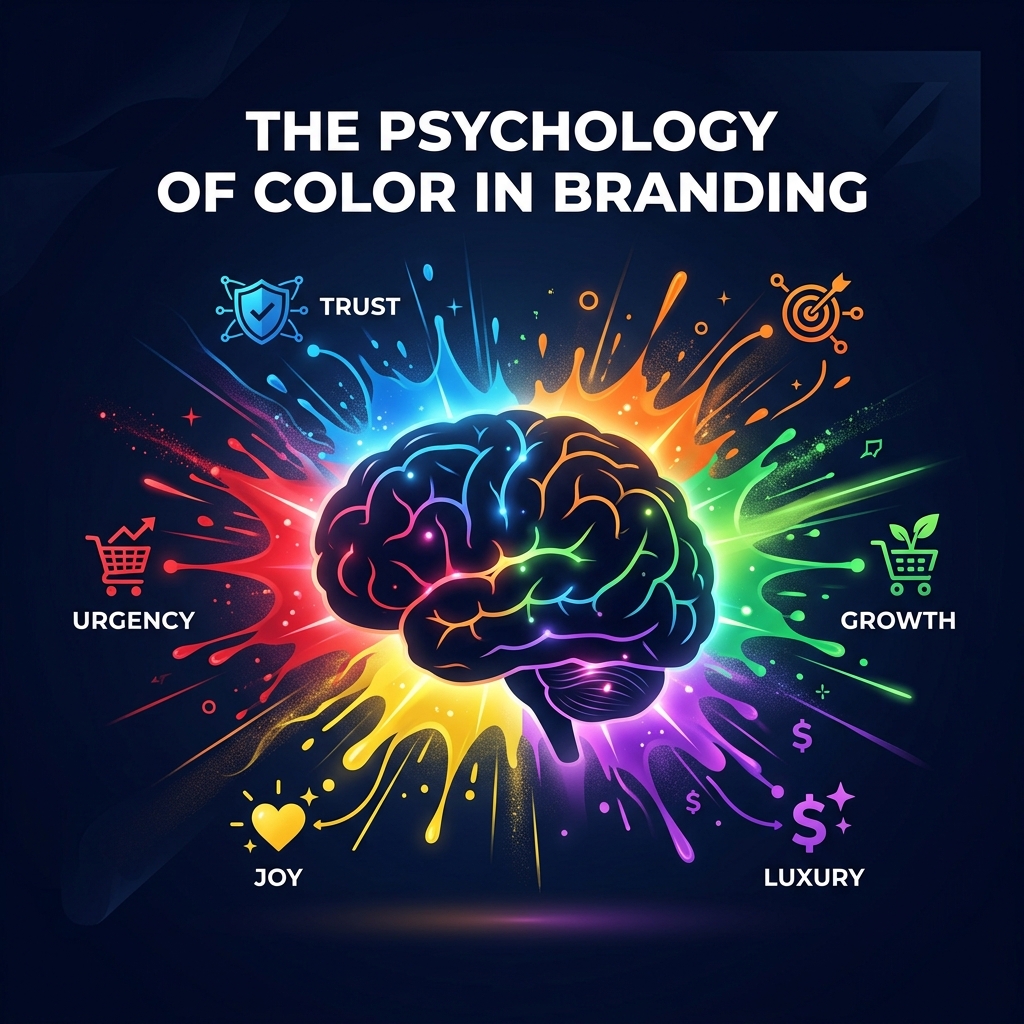
Part 1: The Neuroscience — How Your Brain Processes Color (In Milliseconds)
Before we discuss which colors mean what, let us understand why color affects us so profoundly. The answer lies in neuroscience.
The Speed of Color Processing
Color is processed by the brain’s visual cortex before conscious thought engages. When light enters your eyes, it is converted into electrical signals that travel to the occipital lobe at the back of your brain. Color information is processed in area V4 of the visual cortex — a region that operates automatically and involuntarily.
This means your emotional response to a color happens BEFORE your rational brain gets involved. By the time you consciously think, “That is a nice shade of blue,” your limbic system has already decided whether that blue makes you feel calm, sad, or trusting. Color bypasses logic and speaks directly to emotion.
The Limbic System Connection
Colors activate the limbic system — the brain’s emotional center that governs mood, memory, and motivation. This is why:
- A red notification badge on your phone creates urgency before you read what it says
- Hospitals use pale blue and green because these colors measurably reduce patient anxiety
- Fast food restaurants overwhelmingly use red and yellow because these colors stimulate appetite and create a sense of speed
- Luxury brands use black and gold because these colors activate the brain’s “exclusivity” circuits
In I/O Psychology research, we call this “Affect-as-Information” — people use their emotional responses as information for decision-making. If a brand’s colors make you feel good, you unconsciously conclude that the brand IS good. Your emotional response to the color becomes your evaluation of the product.
The Evolutionary Dimension
Our responses to certain colors have evolutionary roots:
- Red: The color of blood and fire. Evolutionary programming makes us hyper-alert to red — it signals danger, excitement, or important resources (ripe fruit)
- Blue: The color of clear sky and calm water. Our ancestors associated blue environments with safety and stability — no storms, no predators
- Green: The color of vegetation and fertile land. Green signals abundance, health, and resources
- Yellow: The color of sunlight. Associated with energy, optimism, and warmth — but also with caution (wasps, warning signs)
- Black: The color of darkness and night. Associated with the unknown — which creates both fear AND a sense of mystery and sophistication
These evolutionary associations are hardwired — they operate across cultures, age groups, and education levels. While cultural context adds layers of meaning (we will discuss this later), the biological foundation of color perception is universal.
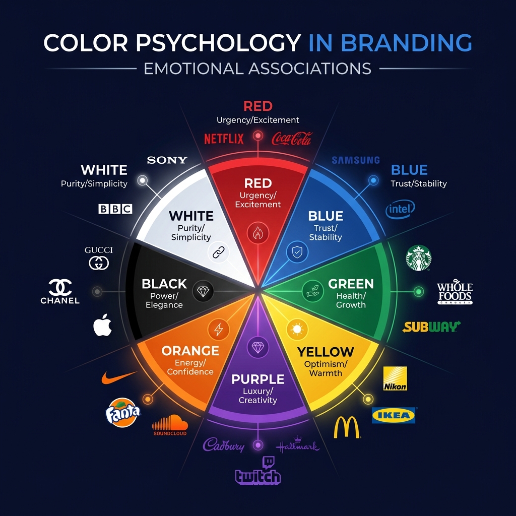
Part 2: The 8 Core Brand Colors — What Each One Communicates Psychologically
🔴 Red — Urgency, Excitement, Passion, Power
Red is the most psychologically intense color. It increases heart rate, raises blood pressure, and stimulates the adrenal glands. In branding, red is used when you want consumers to act immediately.
Psychological Effects:
- Creates a sense of urgency — this is why “SALE” signs are almost always red
- Stimulates appetite — which is why McDonald’s, KFC, Pizza Hut, and Coca-Cola all use red
- Increases impulsive behavior — research shows that red “Buy Now” buttons outperform green ones by 21%
- Signals power and dominance — used by brands that want to feel bold and authoritative
Global Examples: Coca-Cola, YouTube, Netflix, Target, CNN, ESPN
Pakistani Examples: Jazz (energy, dominance in telecom), Coca-Cola Pakistan, KFC Pakistan, Careem’s original brand (urgency to book)
Best For: Food brands, entertainment, sports, sales/clearance, any brand wanting to convey energy and action
Avoid If: Your brand is about calmness, luxury, sustainability, or healthcare — red creates anxiety in these contexts
🔵 Blue — Trust, Stability, Professionalism, Calm
Blue is the world’s most popular color AND the most commonly used in corporate branding. There is a reason: blue is the color of trust. Research consistently shows that blue environments reduce stress, lower blood pressure, and create feelings of security.
Psychological Effects:
- Creates a sense of reliability and trustworthiness — this is why banks, tech companies, and healthcare brands use blue
- Suppresses appetite — the opposite of red. Blue food is rare in nature, so our brains associate it with “not food”
- Encourages productivity and focus — blue environments improve cognitive performance in research settings
- Conveys competence — in job interview research, candidates wearing blue are rated as more competent and trustworthy
Global Examples: Facebook, LinkedIn, Twitter, PayPal, Samsung, IBM, Dell, Intel, Boeing
Pakistani Examples: Telenor (reliability), United Bank Limited (trust), Askari Bank (stability), Pakistan State Oil logo
Best For: Technology, finance, healthcare, B2B services, professional services, any brand where trust is the primary purchase driver
🟢 Green — Health, Growth, Nature, Wealth
Green sits at the center of the visible spectrum, making it the easiest color for the human eye to process. This is why green is associated with balance, calm, and harmony. In branding, green communicates either health/sustainability or wealth/prosperity — depending on the shade.
Psychological Effects:
- Dark green: Wealth, prestige, tradition — used by financial brands wanting to signal old-money stability
- Bright green: Health, freshness, organic/natural products — used by wellness and food brands
- Lime/neon green: Innovation, energy, youth — used by tech startups wanting to feel fresh
- Green reduces anxiety and creates a sense of environmental safety
Global Examples: Starbucks, WhatsApp, Spotify, Whole Foods, Land Rover, John Deere
Pakistani Examples: HBL (growth and national pride — green being Pakistan’s color), Careem (current rebrand — safety and reliability), 14th Street Pizza (freshness)
Best For: Health and wellness, organic food, environmental/sustainability brands, financial services, Pakistani brands leveraging national identity
🟡 Yellow — Optimism, Happiness, Warmth, Attention
Yellow is the most attention-grabbing color in the visible spectrum — which is why it is used for caution signs, taxi cabs, and school buses. In branding, yellow communicates happiness and approachability, but it requires careful handling.
Psychological Effects:
- Stimulates mental activity and energy — yellow activates the anxiety center of the brain
- Creates warmth and friendliness — approachable brands use yellow to feel inviting
- Grabs attention faster than any other color — useful for calls-to-action and signage
- Warning: Too much yellow creates anxiety and agitation. It should be used as an accent, not a dominant color
Global Examples: McDonald’s (the arches), IKEA, Snapchat, National Geographic, DHL, Caterpillar
Pakistani Examples: Jazz (secondary color — energy), Daraz (optimism and deals), Zong (friendliness)
🟣 Purple — Luxury, Creativity, Wisdom, Spirituality
Historically, purple dye was so expensive that only royalty could afford it — and this association persists in our collective psychology. Purple communicates premium quality, creativity, and imagination.
Psychological Effects:
- Activates creative thinking — purple environments improve creative problem-solving in research
- Signals luxury without aggression — softer than black, more creative than blue
- Associated with wisdom and spirituality across many cultures
- Appeals strongly to female demographics — research shows women list purple among their top 3 favorite colors far more than men
Global Examples: Cadbury, Hallmark, Twitch, Yahoo, FedEx (accent), Taco Bell
🟠 Orange — Energy, Enthusiasm, Confidence, Affordability
Orange combines red’s energy with yellow’s friendliness, creating a color that feels exciting but approachable. It is less aggressive than red but more energetic than yellow.
Psychological Effects:
- Creates a sense of enthusiasm and confidence
- Signals affordability and value — orange is rarely used by luxury brands but is extremely effective for budget-friendly positioning
- Stimulates social interaction — orange environments encourage conversation
- Triggers impulse buying — second only to red in driving immediate action
Global Examples: Amazon, Fanta, Nickelodeon, Home Depot, SoundCloud, Harley-Davidson
Pakistani Examples: Ufone (playful, youthful energy), Daraz (deals, excitement), FoodPanda (appetite + energy)
⬛ Black — Power, Elegance, Sophistication, Authority
Black is the ultimate luxury color. It communicates exclusivity, sophistication, and authority. In branding, black says: “We are premium. We are serious. We are worth it.”
Psychological Effects:
- Creates a sense of exclusivity and luxury — used by virtually every high-end fashion brand
- Signals authority and competence
- Increases perceived value — products in black packaging are rated as more expensive and higher quality
- Can feel intimidating or cold if overused without warmth elements
Global Examples: Chanel, Nike, Apple (product design), Prada, Adidas, Uber
⬜ White — Purity, Simplicity, Cleanliness, Modernity
White communicates minimalism, clarity, and modernity. In web design, white space (negative space) is the single most powerful design tool — it makes everything else more impactful.
Psychological Effects:
- Creates a sense of openness and cleanliness
- Reduces cognitive load — white space makes content easier to process
- Signals modernity and innovation — Apple’s use of white space is iconic
- Cultural note: In Western cultures, white symbolizes purity. In parts of East Asia, it is associated with mourning — critical for global brands
Global Examples: Apple (marketing), Google, Tesla, Zara, Uniqlo
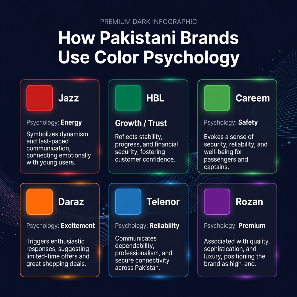
Part 3: Color Psychology in Pakistani Branding — A Cultural Analysis
Color psychology is not universal — cultural context significantly modifies color associations. In Pakistan, several unique factors shape how consumers respond to color:
Green: Pakistan’s National Identity Color
Green carries a unique psychological weight in Pakistan that it does not carry in most other markets. As the color of the Pakistani flag and Islamic identity, green triggers feelings of national pride, trust, and belonging. This is why HBL — Pakistan’s largest bank — uses green as its primary brand color. The green is not just “growth” and “wealth” (its standard psychological associations) — it is also “this is a Pakistani institution you can trust.”
For Pakistani brands targeting domestic consumers, incorporating green — even as a secondary color — creates a subconscious association with national identity and cultural authenticity. This is Cultural Anchoring in action.
Red: From Danger to Festivity
While red universally signals urgency and excitement, in Pakistani and South Asian culture, red has additional powerful associations: weddings, celebration, and fertility. Bridal red is the most auspicious color in Pakistani wedding culture. Brands targeting the wedding industry, festival products, or celebratory occasions can leverage this cultural layer of meaning that does not exist in Western markets.
Gold: The Universal Pakistani Luxury Signal
Gold carries extraordinary psychological weight in Pakistani consumer culture. Pakistan has one of the world’s highest per-capita gold consumption rates. Gold does not just signal luxury — it signals investment, security, and generational wealth. Brands that incorporate gold accents are tapping into deep cultural associations with prosperity and family legacy.
The Digital Color Shift
An interesting trend in Pakistani digital brands: companies that use warm colors (orange, red, yellow) in traditional marketing often shift to cooler colors (blue, purple, teal) in digital interfaces. This is because screen-based interactions have different psychological dynamics — users spend longer times looking at digital interfaces, and warm colors create eye fatigue over extended use. FoodPanda’s orange works for a logo and app icon (quick recognition), but their app interface uses significant white space and neutral tones for comfortable extended browsing.
Part 4: How to Choose the Right Colors for YOUR Brand — A Practical Framework
After understanding the science, here is a step-by-step framework you can use today:
Step 1: Define Your Brand Personality (Before Choosing Colors)
Ask yourself: if your brand were a person, what 3 adjectives would describe them?
- Trustworthy, reliable, professional → Blue family
- Energetic, bold, exciting → Red/Orange family
- Creative, luxurious, unique → Purple family
- Healthy, natural, growing → Green family
- Premium, sophisticated, powerful → Black + Gold
- Friendly, optimistic, approachable → Yellow/Orange family
- Clean, modern, innovative → White + Blue
Step 2: Research Your Competitors’ Colors
If every competitor in your industry uses blue, you have two strategic options:
- Conform: Use blue to signal that you belong in the same category (leveraging the Mere-Exposure Effect — familiarity breeds trust)
- Differentiate: Use a completely different color to stand out (leveraging the Von Restorff Effect — distinctive items are remembered better)
Neither strategy is inherently better — it depends on whether your brand’s primary challenge is credibility (conform) or visibility (differentiate).
Step 3: The 60-30-10 Rule
Professional designers and psychologists agree on this ratio:
- 60%: Dominant color (your main brand color) — creates the overall mood
- 30%: Secondary color (complementary) — adds visual interest and depth
- 10%: Accent color (contrast) — draws attention to calls-to-action, buttons, and key elements
This ratio prevents visual chaos while ensuring enough contrast to guide the eye. Most brands that “feel off” are violating this ratio — using too many colors at equal weight, creating cognitive overload.
Step 4: Test Color Combinations With Real Users
Never finalize brand colors based solely on personal preference. The psychology of color is contextual — a color that works for one audience may fail with another. A/B test your website’s call-to-action buttons, landing page headers, and key visual elements with different color options. Let data, not opinion, make the final decision.
Step 5: Ensure Accessibility
Color psychology means nothing if 8% of your male audience (those with color vision deficiency) cannot see your design properly. Always:
- Check color contrast ratios (minimum 4.5:1 for body text, 3:1 for large text)
- Never rely on color alone to convey information — use icons, labels, or patterns as well
- Test your design with colorblindness simulation tools
Part 5: Color Psychology in Web Design — Where It Matters Most
As a professional web developer, I apply color psychology on every project. Here are the specific areas where color decisions have the highest psychological impact:
Call-to-Action Buttons
Your CTA button color is arguably the single most impactful color decision on your website. Research findings:
- The CTA button should be the highest-contrast element on the page — it must visually “pop”
- Red and orange CTAs outperform blue and green in e-commerce contexts (urgency drives action)
- Green CTAs perform better for subscription and sign-up forms (green = safety = “this is a safe action”)
- The best CTA color is not universal — it is whichever color creates the most contrast with your page background
Background Colors
Background color affects reading comfort, time-on-page, and perceived brand quality:
- White background: Professional, clean, easy to read — best for content-heavy sites
- Dark background: Premium, sophisticated, dramatic — best for creative, portfolio, and entertainment sites
- Colored backgrounds: Must be used carefully — ensure text contrast meets accessibility standards
Navigation and Header
Your navigation bar is the first thing users interact with. Its color sets the tone for the entire experience:
- Navigation in your primary brand color reinforces brand identity on every page
- Transparent or white navigation feels modern and open
- Dark navigation feels authoritative and structured
The Bottom Line: Color Is Your Brand’s First (And Most Powerful) Word
If there is one thing you take away from this article, let it be this: color is not a design decision — it is a business strategy. Every color in your branding is a psychological message that consumers decode in milliseconds, long before they read your copy, evaluate your product, or compare your prices.
The brands that dominate their industries — Coca-Cola, Apple, Facebook, Starbucks — did not become iconic by accident. They understood that color is the fastest, most efficient channel to the consumer’s emotional brain. They chose colors that align with their brand personality, their target audience’s psychological needs, and their competitive positioning. And they used those colors consistently across every touchpoint until the color itself became synonymous with the brand.
Whether you are building a new brand from scratch, redesigning your website, or evaluating why your current branding “feels off” — start with color. Get the psychology right, and everything else — design, messaging, positioning — becomes dramatically easier.
Because in the end, consumers do not buy the best product. They buy the product that feels right. And feeling starts with color.
Need help choosing the right color palette for your brand? As a Web Developer and UX Psychologist, I design websites and brand identities grounded in behavioral science — not just aesthetics. Every color choice on my projects is backed by psychological research. Schedule a consultation to build a brand that does not just look good — it feels right to your audience.
Muhammad Shahzeb is an Industrial & Organizational Psychologist (MSc) and Professional Web Developer specializing in psychology-driven web design and brand strategy. Read more on UX Psychology | Brand Psychology Audits | Web Development | Career Coaching